Test your creativity with the Spark Creator Block which allows you to build out custom blocks and create unique content.
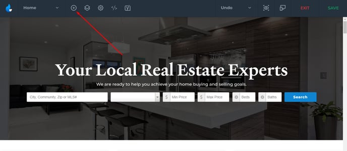
Go into the Spark Editor, and click on 'Add New Block'.
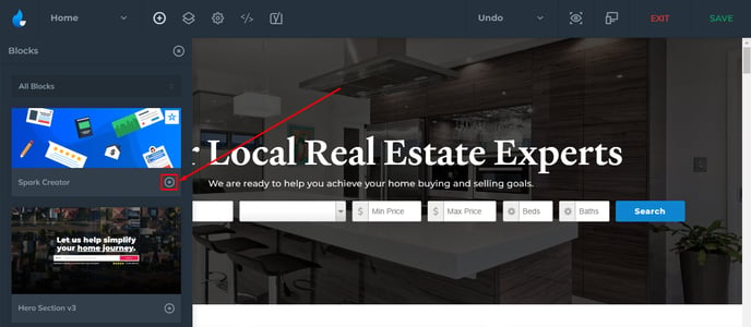
Find the Spark Creator and click on the 'Add Block' button.
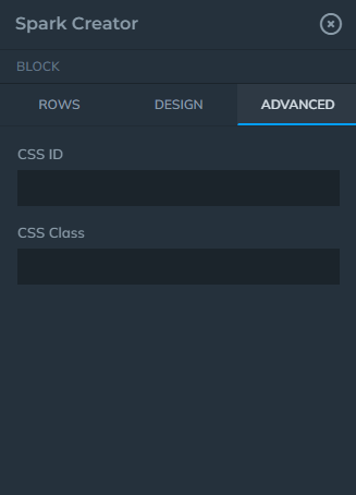
Once you have the block added, select the block from Layers View to start editing and adding content. First thing you will notice is that there are the 3 tabs, Rows, Design, and Advanced.

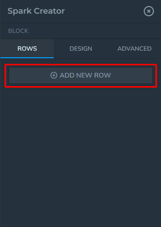
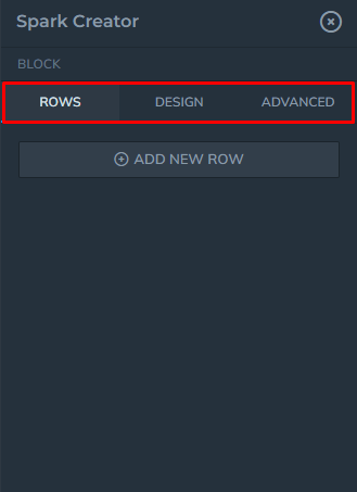 Rows
Rows
The Rows tab is the place where you add your content. You can add a new row by selecting 'Add New Row'. (you can have multiple Rows in a Block)
Rows act the same way as blocks in its basic functions. You can delete, duplicate, rename (right click), and re-order.
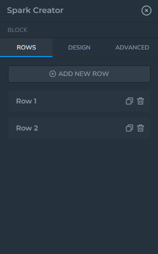
Each row that is created will have Columns, Settings, and Advanced tabs.
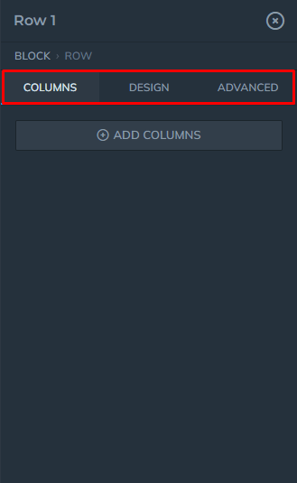
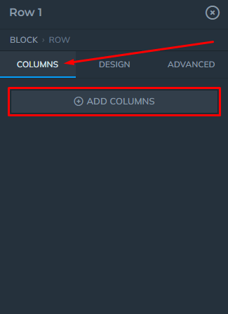
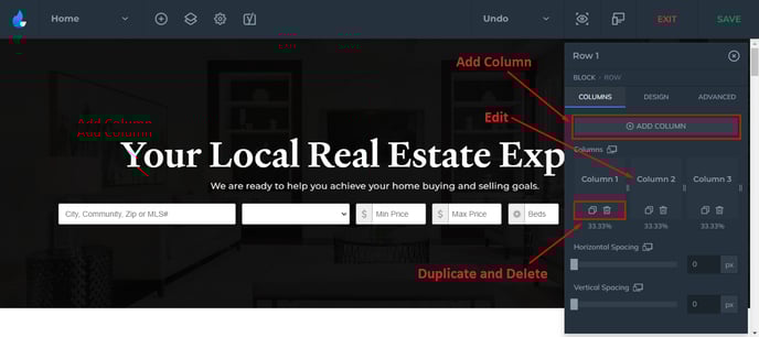
Columns
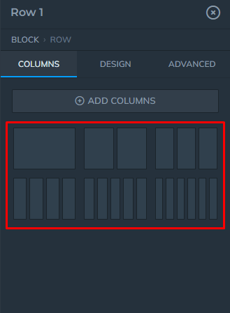
Collapse the Columns tab and select the Add Columns button to add a new column.
You will be offered layout choices which you can choose from.
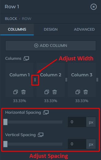
Once you choose a layout, you can add, edit, delete, and duplicate columns.
You can also adjust the column's width and spacing.
When you edit a column, it will have Widgets, Design, and Advanced tabs.
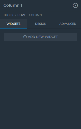
Widgets
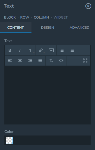
Under the Widgets tab you will have different widgets to add, starting from Text Widgets, Image, Button, to some of more complex widgets like Video, Map, Lead Forms, etc.
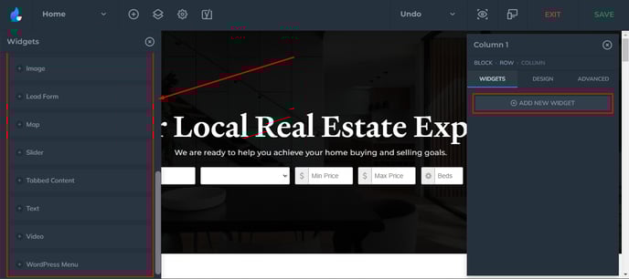
Each widget will be different in terms of their customization options. Also, each widget will have 3 tabs similar to the previous elements:
These options also vary depending on the widget type.
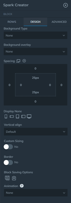
Design
In the Design settings, you can adjust things like Background, Overlay, Spacing, Responsiveness, Display None (Click on the device size to hide the block), and Borders.
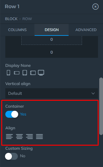
Row's Design tab has the same options that you can adjust for the Block settings, with few exceptions like 'Container' and 'Alignment':
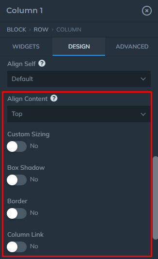
Column's Design tab has the same options as Block and Row's, with the exceptions shown below:
Advanced
For advanced CSS usage.