Spark Header: Creating a New Header
Learn the basics of the Spark Headers for Desktop and Mobile.
To get started, go into your admin dashboard, navigate to General Content > Menus > Headers.
Once you clicked on Headers, click on the + sign to Add a New Header
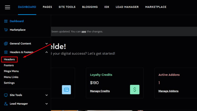
You have the option to build Custom Headers from scratch, but there is always an alternative to build one out of the templates we have:
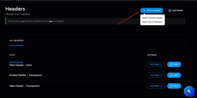
In case you go for the template option, a new window will come up where you can choose the header style, then you will need to name your Header, and lastly Add the Header on the bottom of your screen.

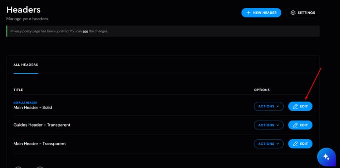
or you can edit the existing headers which can be done by clicking on the Edit button. (By default your site will have a Header)
Once you are in the Menu Editor, you will notice 4 options on the top side which are:
- Desktop
- Settings
- Mobile
- Target
Now let's break down each tab, and how to use them. We will cover Targeting in a separate article.
Desktop
This tab is where you essentially customize the most of the options that are available for desktop and laptop view.
To see the options/features available for customization, click through all of these tabs to collapse them:
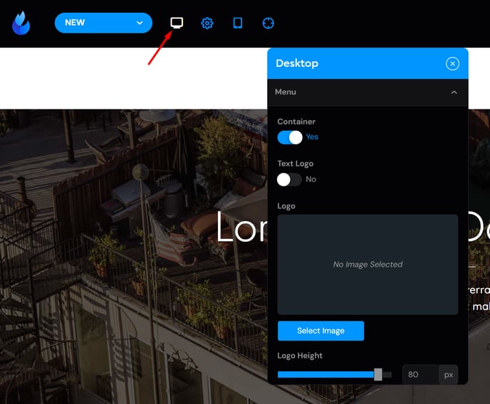
Menu Tab Features:
-
Container/No Container
-
Text Logo/ Image Logo
-
Logo Height
-
Menu Selection
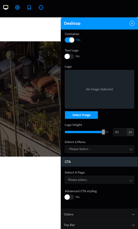
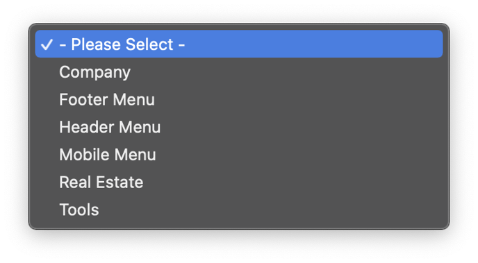
Collapsing the "Select a Menu" tab will allow you to select which menu to include in the header.
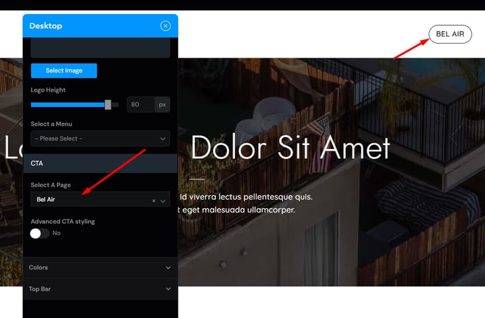
There are further Options below this tab:
- CTA which adds a specific page as a Side Menu:
Settings Tab
Settings tab allows you to choose between two Header styles:
-
Standard
-
Absolute


Key difference: Absolute style has a transparent look.
Sticky Header
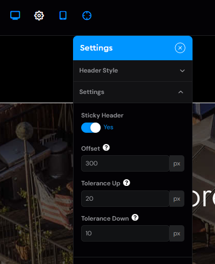
You can enable/disable Sticky header, and change it's values.
Sticky Header enabled:

Sticky Header disabled:

They key difference is that, when you have a sticky header enabled, it will stay pinned to the screen until the point of offset that is set. In this case after i scroll down 800px, the header will slowly disappear.
Colors Tab
Colors this section allows you to customize the background color, link color, link hover color, text color, and border color (located beneath the header):

Top Bar
This tab allows you to customize the Top Bar of your header, where you can include:
-
Social buttons
-
Text
-
Menu
-
And enable/disable Top Bar Container (scroll down for more on this)
Note: This can be applied to both left, and right side columns
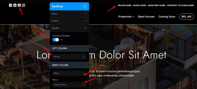
Collapsing each of the columns will allow you to include these:
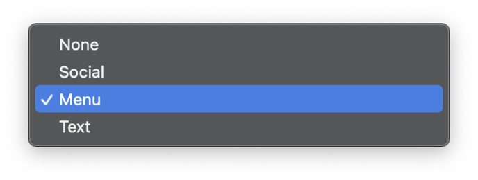
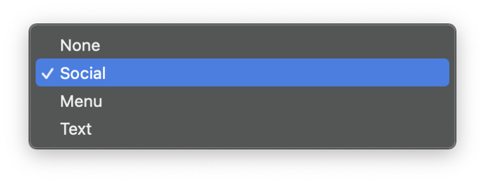
Enabling/Disabling the Top Bar Container
Top Bar Container: NO

Top Bar Container: YES

Mobile Menu

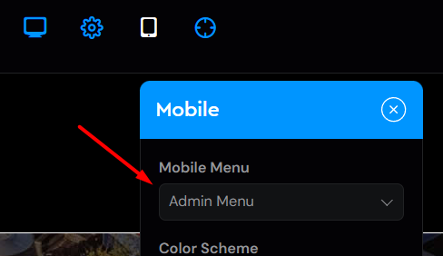
This is the place where you customize your Menu for Mobile. To preview the menu, click on the little hamburger menu on the right side.
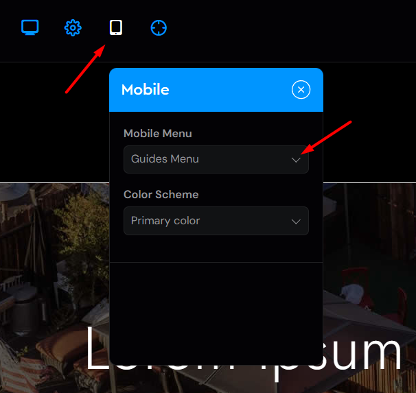
You can select which menu to include for the mobile version:
And you can select its Color Scheme:
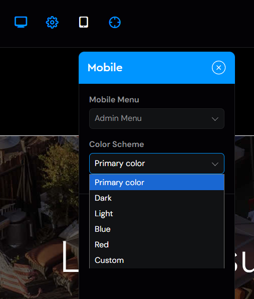
Note: Primary color will pull the color from the site's primary color you choose beforehand.
Once you are happy with the changes you made to your header, click on the Save button to save all your changes, and lastly the Exit button to exit the Header Editor.


