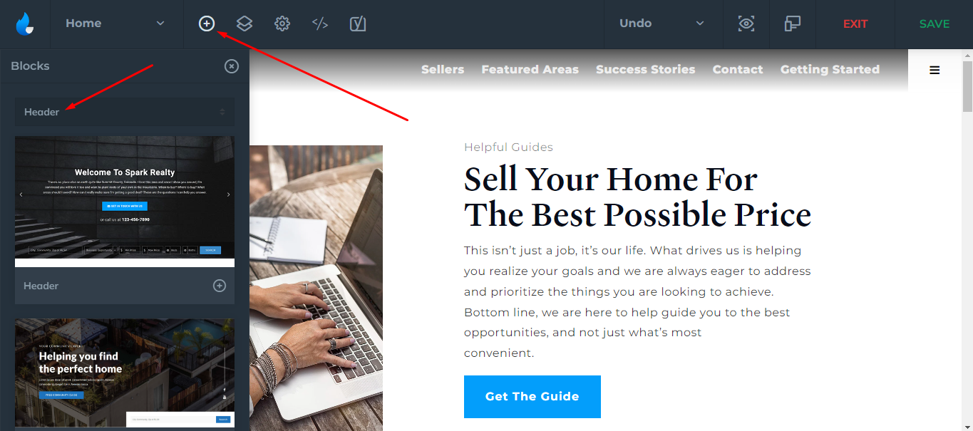
Every Header Block includes a few options that you can setup with a few clicks.
Let's get into the structure:
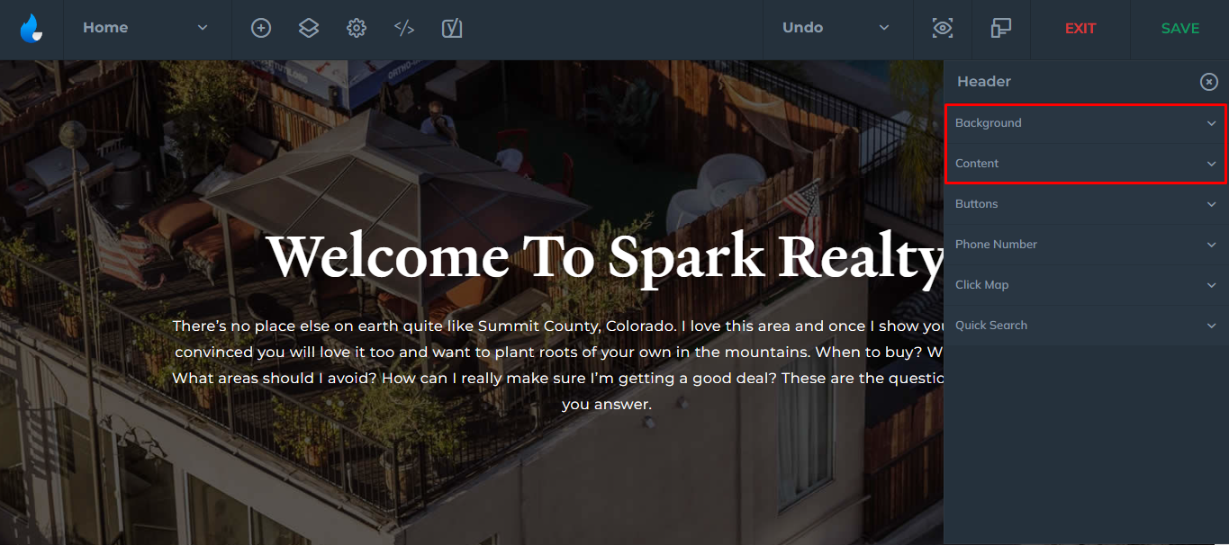
The structure will be different for each style, but every Header will have a Background and a Content tab. We will cover the additional tabs further in the article.
Selecting one of the options will collapse the attributes.
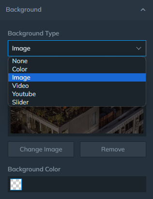
Background

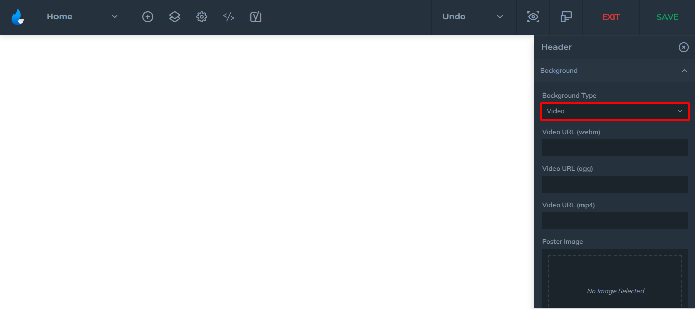
You can set a background to be a: Solid Color, Image, Video, YouTube Video, or a Slider.
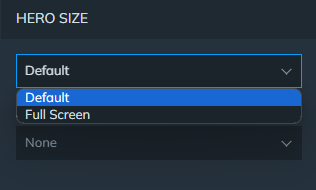
Also there is an option to make the Header Full Screen:
In case you decide to have a video header, ALL the file formats below need to be added along with a video in order for it to play on all devices. Recommended this feature be configured for you via Express Setup.
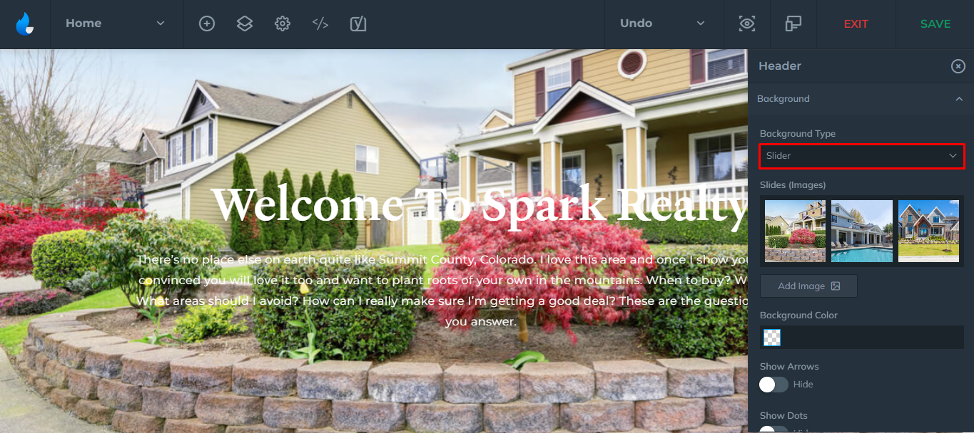
As for the sliders, you will need to add the images you want for the slider.
You can also additionally show/hide navigation arrows or dots within the slider, enable/disable fade effect of the transition as well as the slide transition/duration.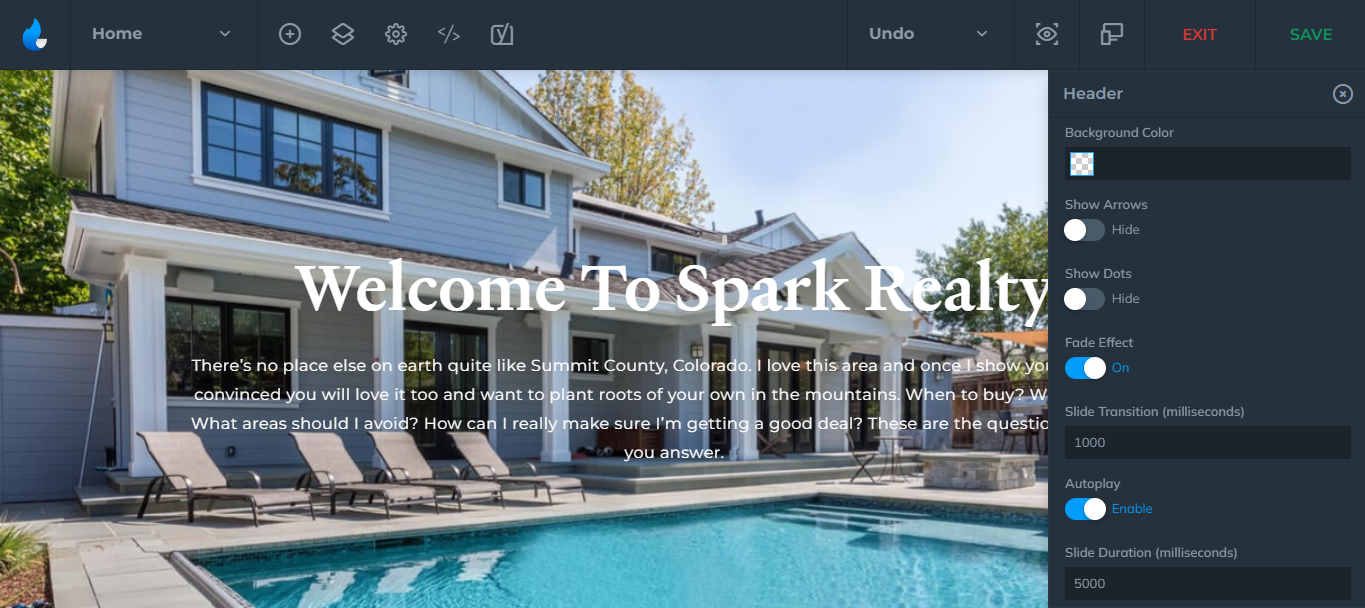
Note: 1000 milliseconds = 1 second
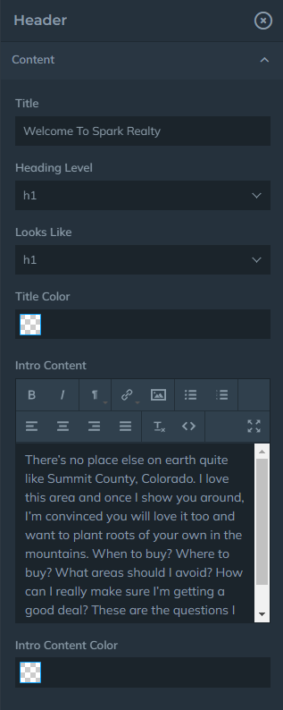
Content

Next option would be the Content, this would be the title and the text that goes into the Header Block. This can be customized as in a standard WordPress text editor, you can also set the color of the title/text, and block size to default or full screen.
Additional Options based on Header Styles
At the very beginning of the article, I had mentioned that each Header Block shared a common attribute, which are Background and the Content tab. However, there are a few additional attributes you may have depending which Header style you have chosen.
Scroll below to find the additional tabs your Header contains.
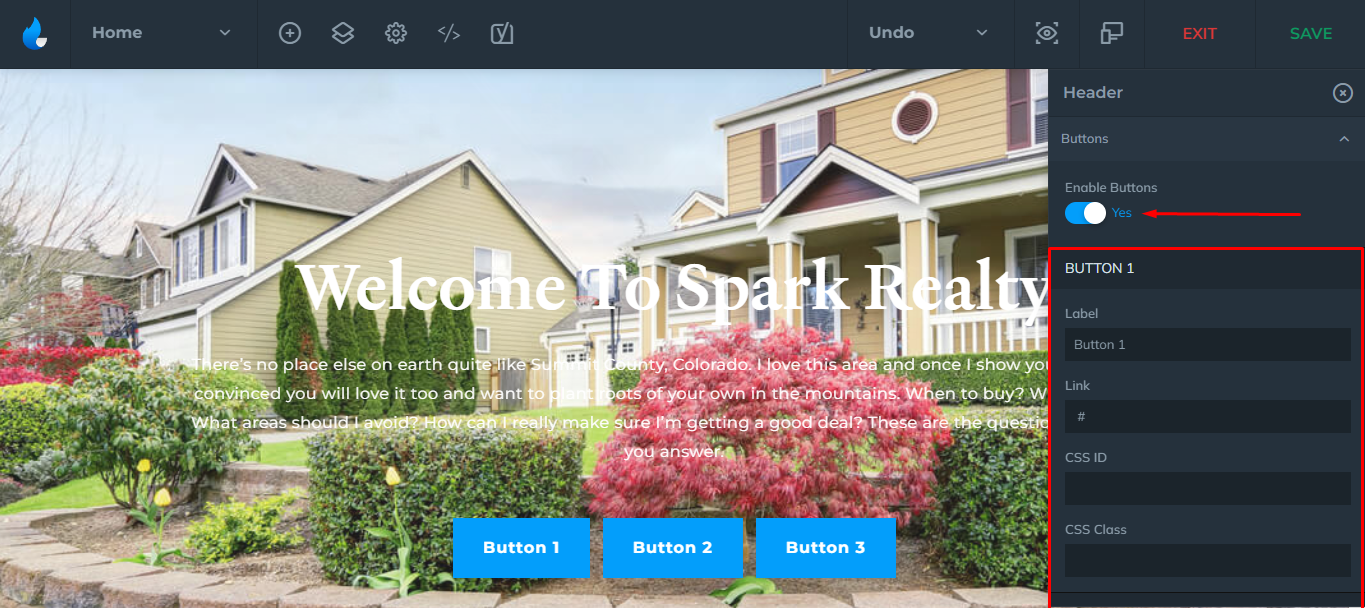
Buttons
You can have up to 3 buttons in the Header Block and where they lead. By default, you will have 1 button enabled, but it can be disabled by clicking on the yes/no button under Enable Buttons.
Note: Buttons with empty fields are not shown!
Phone Number
One of the attributes is Phone Number:
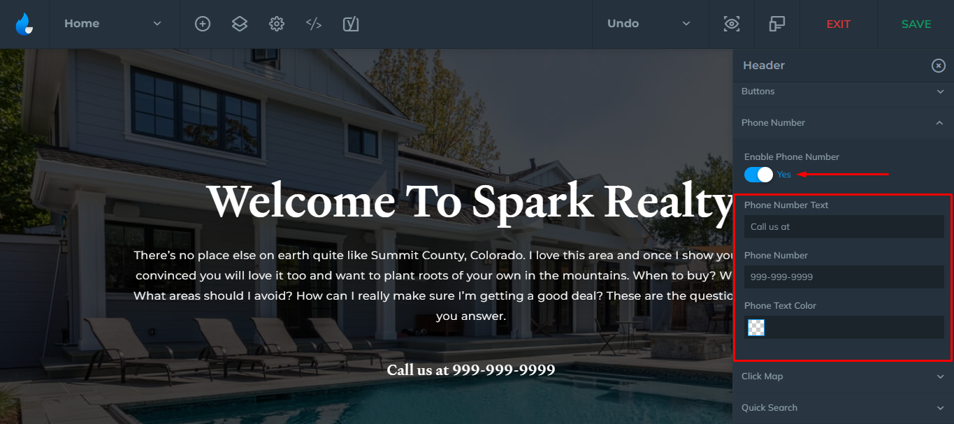
If you don't want this feature enabled in your Header Block, simply click on the first button "Enable Phone Number"
You can also place a short text, enter the actual phone number, and set a different color for it.
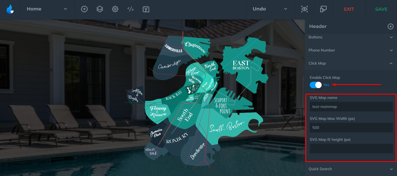
Click Map
If you ordered AF ClickMaps™ there is nothing else for you to do. The feature is built by one of our designers and will be set up for you! The feature does not require any action from you to be displayed, but you will have the ability to enable/disable with one single click!
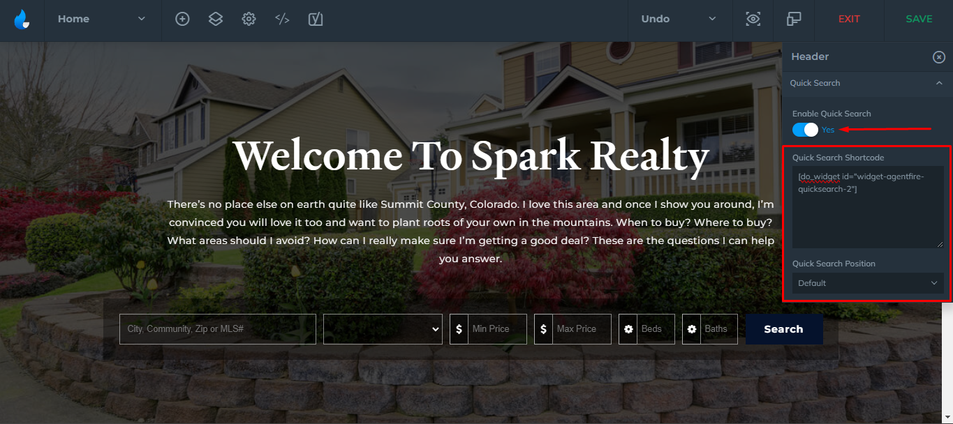
Quick Search
You can enable/disable a quick search to your Header Block. To do so, click on the Enable Quick Search button, and you can set the position of it.
Note: This is configured during the IDX ordering. For further customization of the quick search visit ShowcaseIDX's Video Tutorials page and scroll down to the Using Shortcode Widgets video.
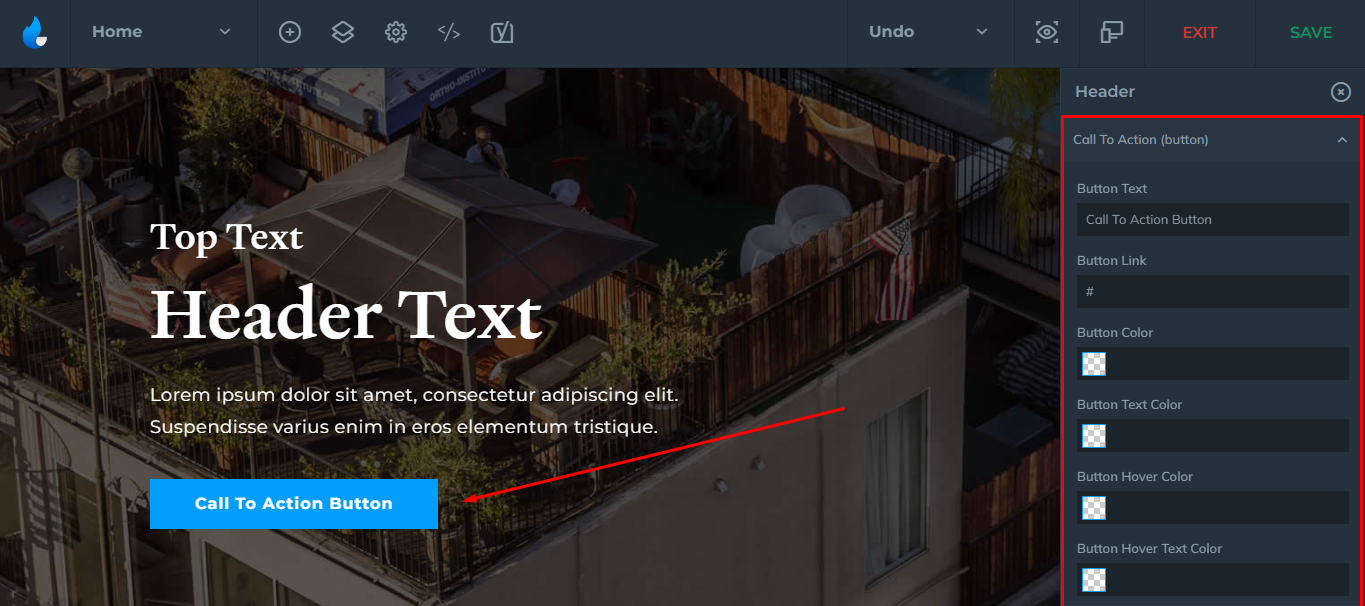
Call to Action (Button)
You can customize the Text, Link, Button Color, and Hover Color for your CTA Button. Customize it a bit more by adding custom CSS!
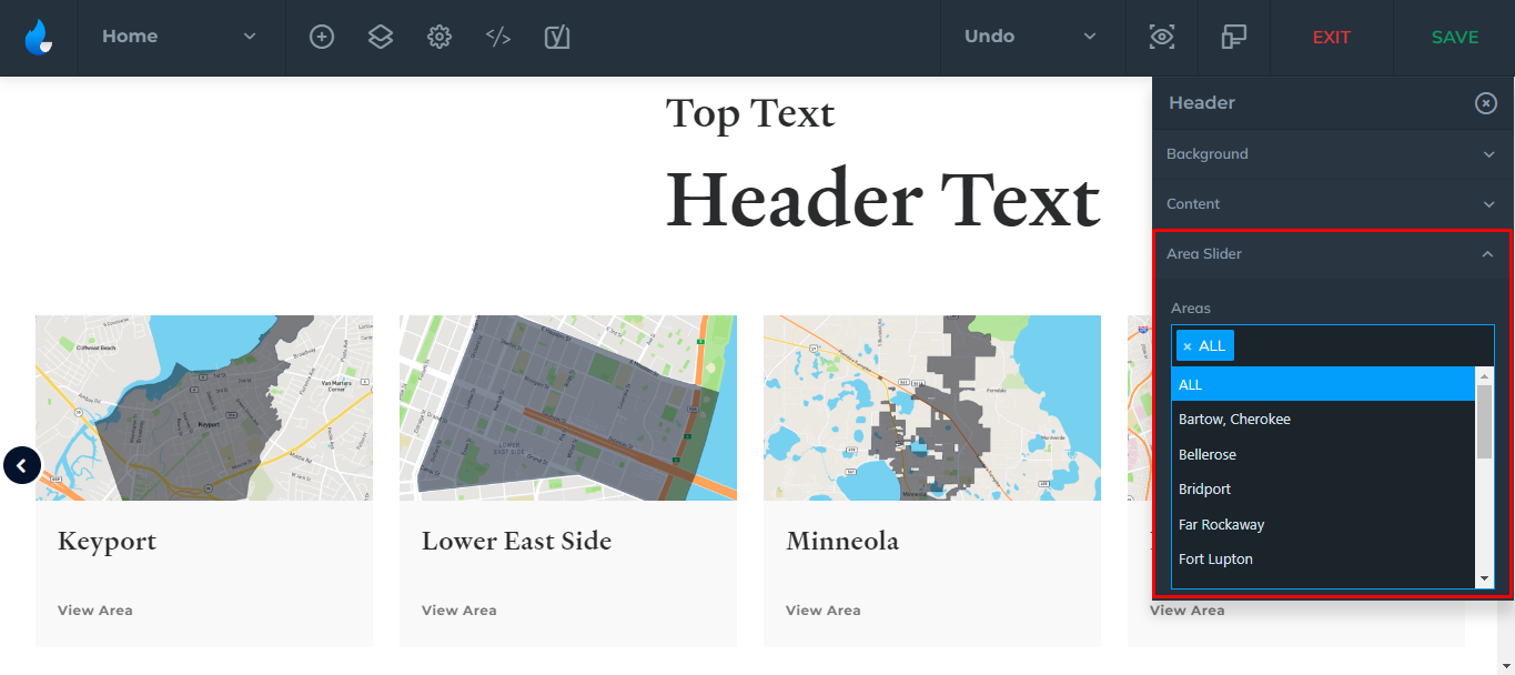
Area Slider
If your Header style has an Area Slider, you can include your Area Guides by typing the area name in the field you previously created using the Area Guides plugin to feature it.
Note: All areas will be featured by default.