Display your content quickly and easily.
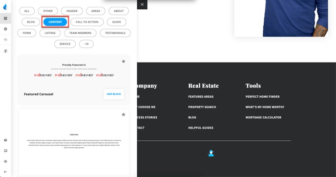
Want to select a Content block? Select 'Add New Block', expand categories and select Content.
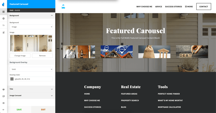
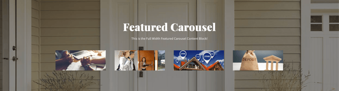
Featured Carousel

Block Features:
-
Background Image/Color
-
Title/Title Color
-
Title Look Like (Size - h1, h2, h3, etc.)
-
Sub Title Color
-
Carousel Images
Example:
Content
Block Features:
-
Background Image/Color
-
Title/Title Color
-
Title Look Like (Size - h1, h2, h3, etc.)
-
Content/Content Color
-
Align (Left, Right, Center, Justify)
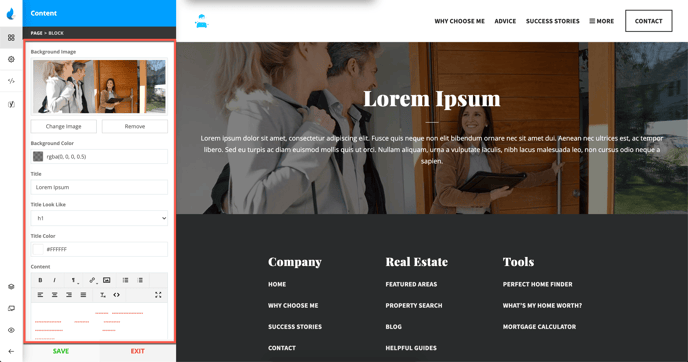
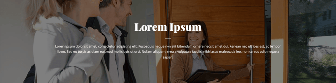
Example:
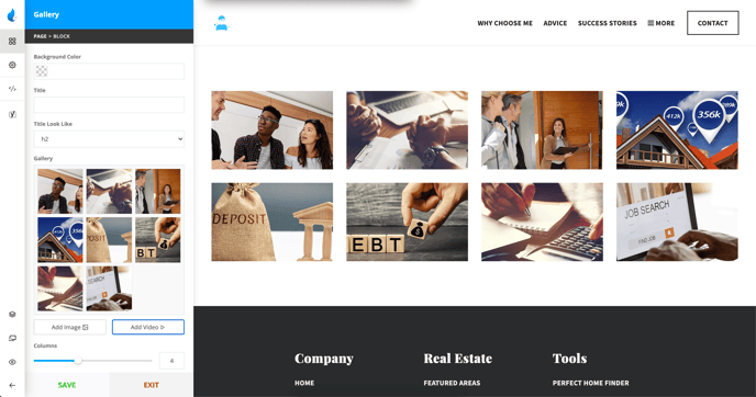
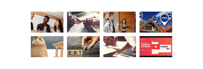
Gallery
Block Features:
-
Background Color
-
Title
-
Title Look Like (Size - h1, h2, h3, etc.)
-
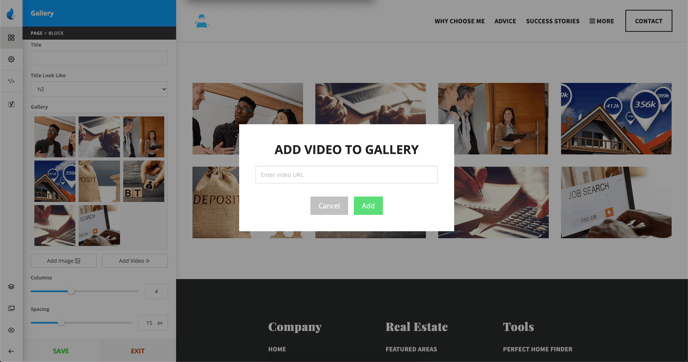
Gallery (Add Image/Add Video)
-
Columns (1-9)
-
Spacing
Add Video to the Gallery
Example:
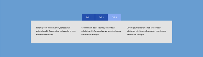
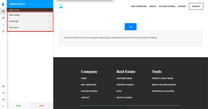
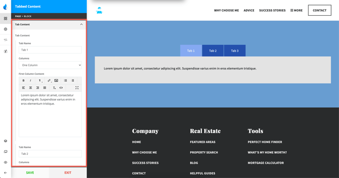
Tabbed Content
Block Attributes:
-
Block Settings
-
Tab Settings
-
Tab Content
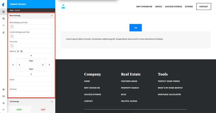
Block Settings
-
Block Background Color
-
Content Background Color
-
Font Color
-
Spacing
-
CSS Properties (CSS ID/CSS Class)
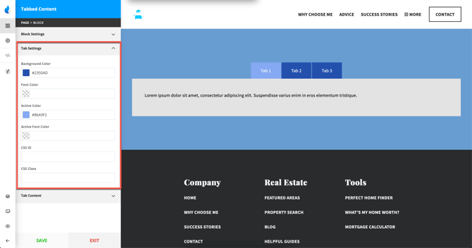
Tab Settings
-
Background Color
-
Font Color
-
Active Color
-
Active Font Color
-
CSS Properties (CSS ID/CSS Class)
Tab Content
-
Tab Name
-
Columns (1, 2 or 3)
-
Column Content
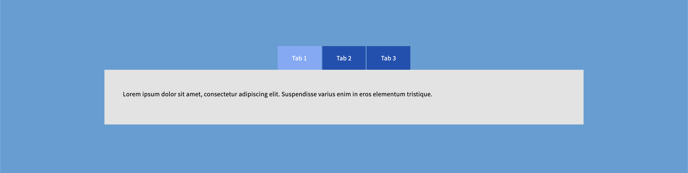
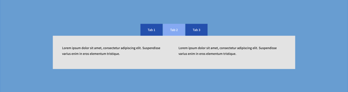
Examples:
Single Column:
Double Column:
Triple Column: