The About block has a few variations you can select from, which can be added via Add New Block, and selecting About in the categories.


Simple About Block with centered Title and Text. The features you can adjust are:
-
Background Color
-
Title/Title Color
-
Text/Text Color
-
Button link/Button Label (button text)
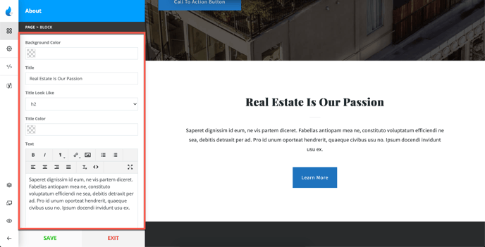
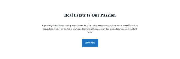
Style 1 Example:
About Style 2 Features
About Block with 2 Columns (Content + Image, Click Map, or Video). The attributes you can adjust are:
-
Background Color
-
Title/Title Size/Title Color
-
Text/Text Color
-
Button link/Button Label (button text)
-
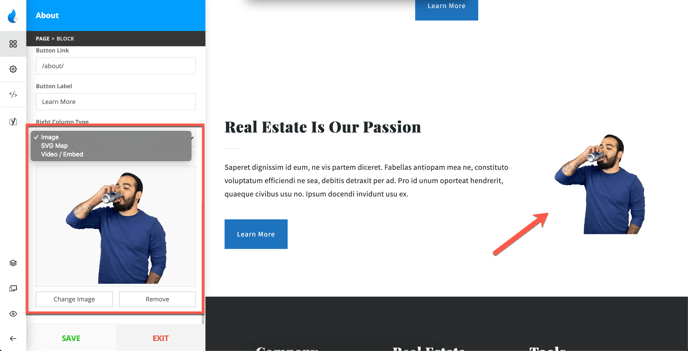
Right Column Content (Image, Click Map, or Video)
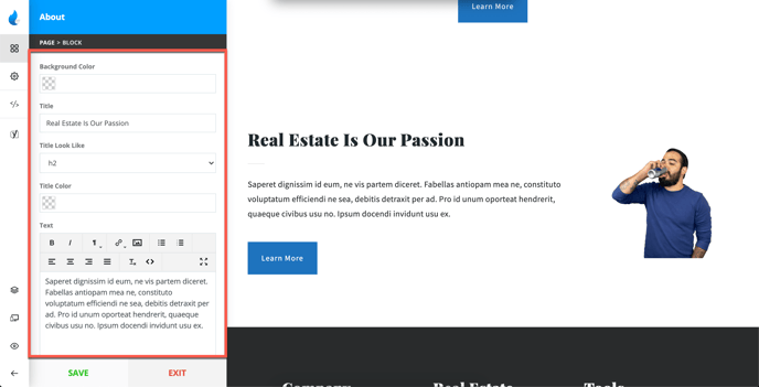
For the Right Column you can choose to have an Image, Click Map (SVG), or a Video as you collapse the settings.
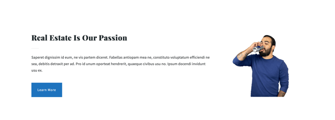
Style 2 Example:
About Style 3 Features:
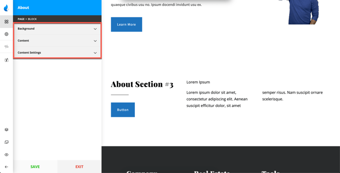
About Block with 2 Columns (Title & Button on the left side, Content on the right side)
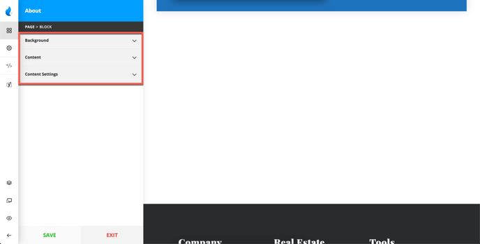
This style is split into 3 parts:
-
Background
-
Content
-
Content Settings
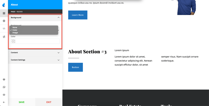
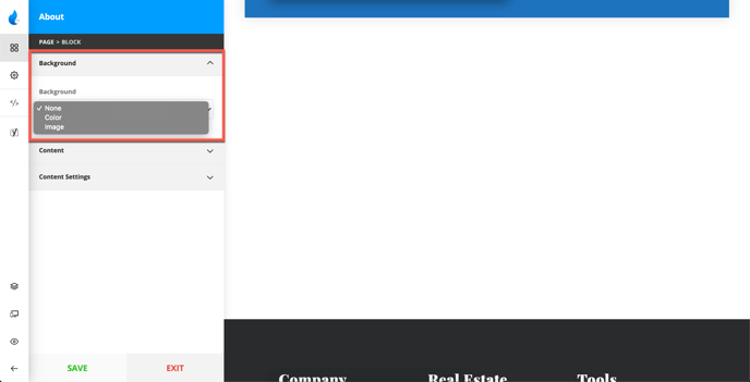
Background
For the background you can have a Solid Color, or an Image
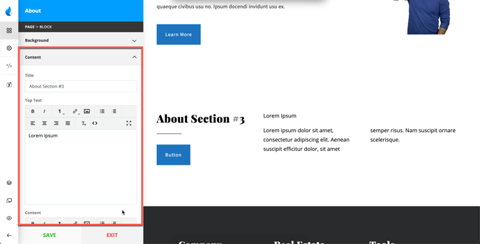
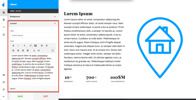
Content
For Content, you can add:
-
Title
-
Top Text
-
Content (which is in most cases additional text)
-
Button Text/Link
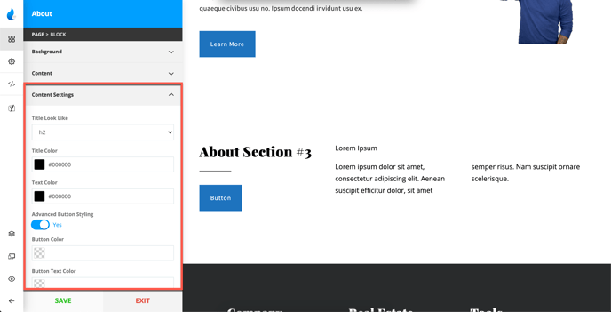
Content Settings
This tab contains several options, which are:
-
Title Size/Color
-
Text Color
-
Advanced Button Styling (Colors, and Hover Colors)
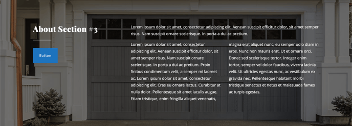
Style 3 Example:
About Style 4 Features
About Block with 2 Columns (Left side: Content + Items, Right side: Video/Image)
This About Style is split into 3 parts:
-
Background
-
Content
-
Content Settings
Background
For Background you can select a Solid Color or an Image.
Note: If you select Image as a background you will be able to add additional overlays like some of the previous examples.
Content
For Content you can add and adjust a few things:
-
Title
-
Text
-
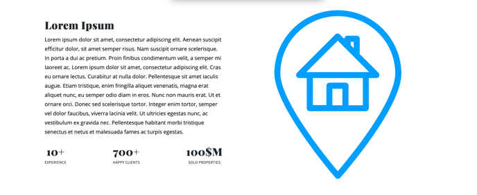
Items (Up to 3)
-
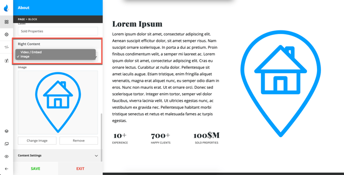
Right Column Content (Video/Image)
For the right side Content can be an Embedded Video or an Image, although, this style has a video as a default.
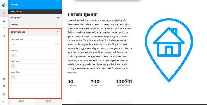
Content Settings
Here you can adjust:
-
Title Size/Title Color
-
Text Color
-
Label Color (Text for the Items)
Style 4 Example: